My encounter with the world of typography happened during my university years, and it immediately stirred deep emotions within me. Typography evokes a sense of intimacy, care, and warmth. I find paper to be a fascinating and noble material, which is why I feel great satisfaction when working on projects in this field.
This project was designed to convey a sense of freshness and innovation in how a client positions itself against the competition. Since the brochure was handed directly to customers by sales representatives and explained in person, I aimed to break away from traditional approaches by offering a non-conventional and dynamic solution, much like the company intends to do with its product.
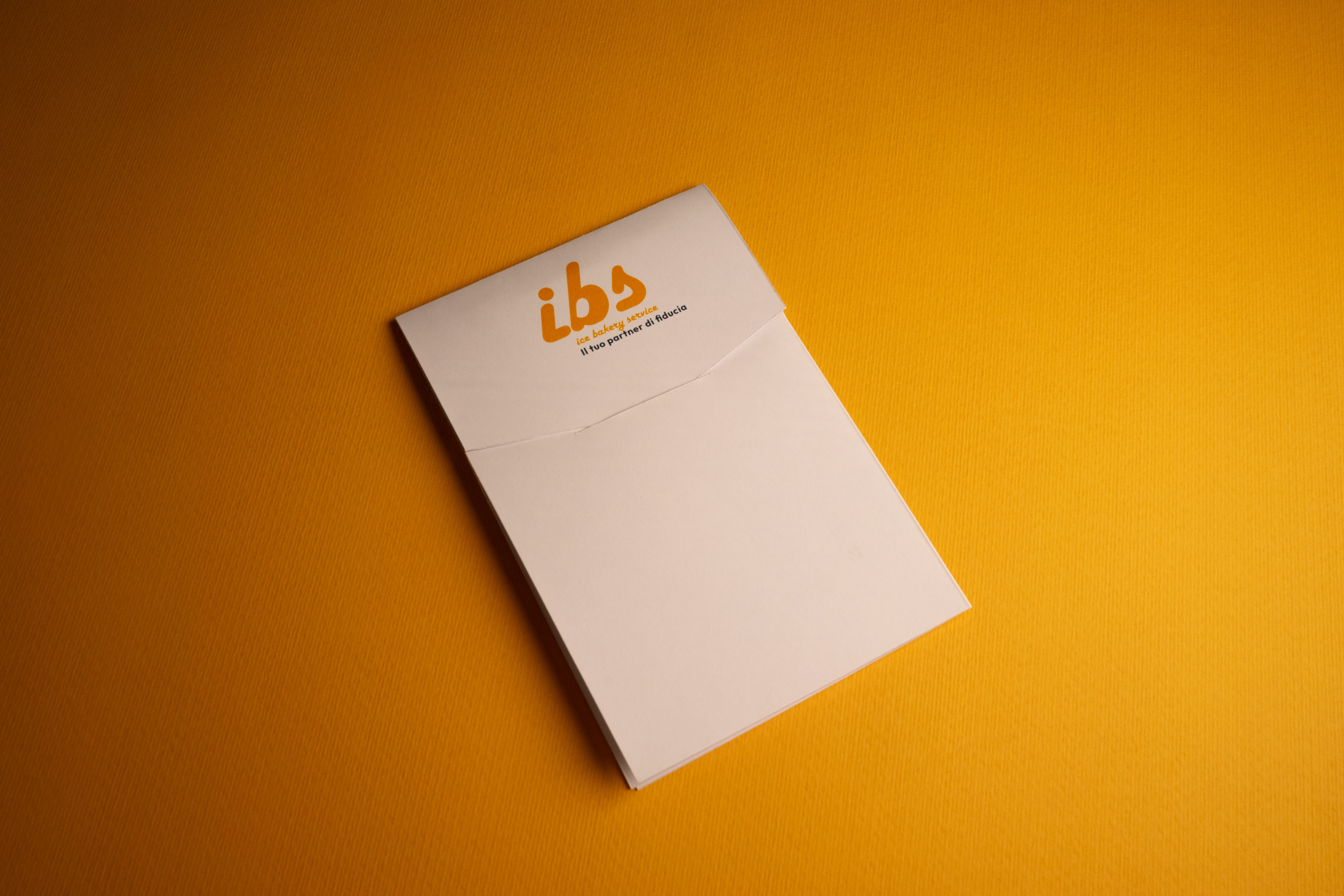

This project stems from the desire to tell IBS customers about their reality.
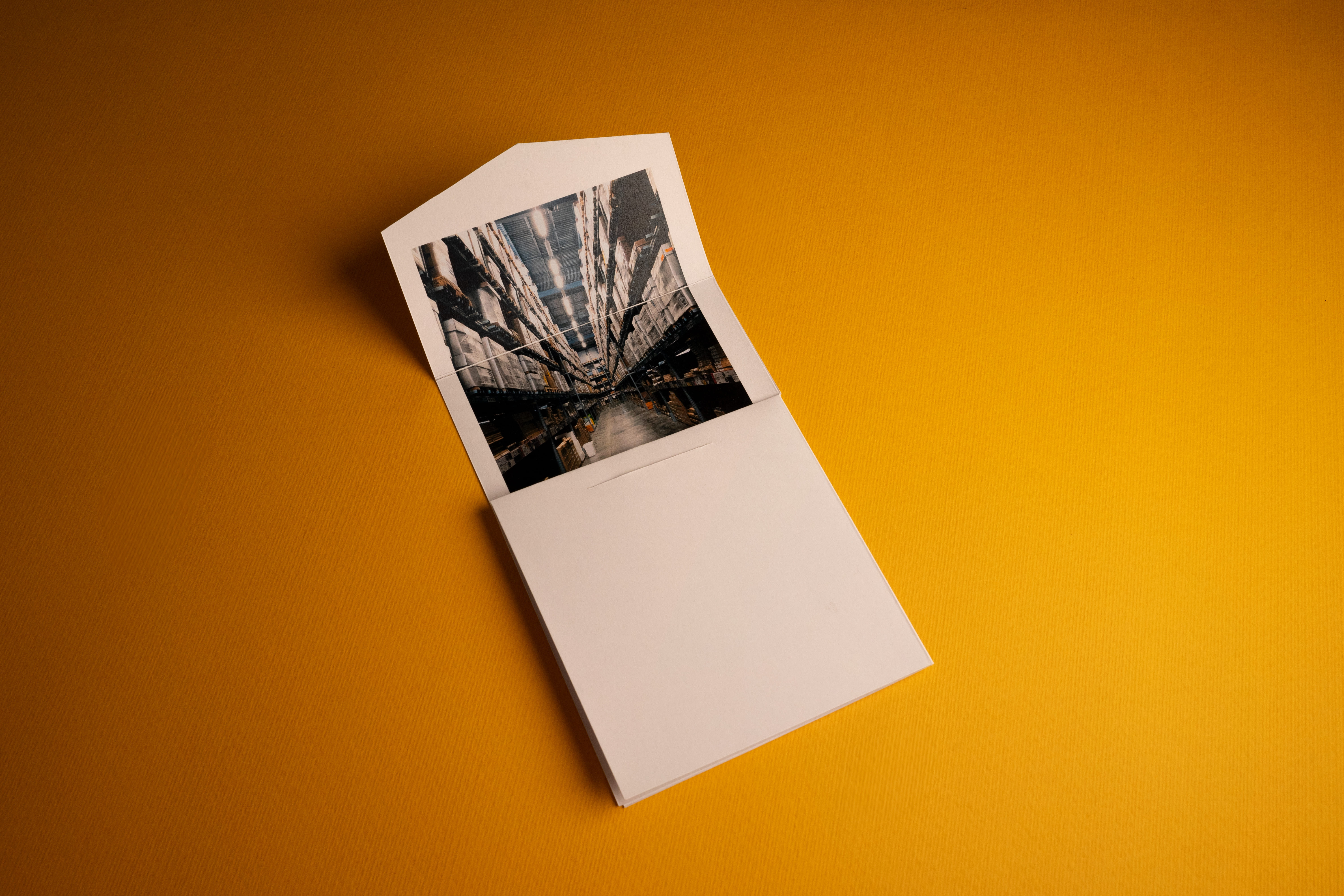
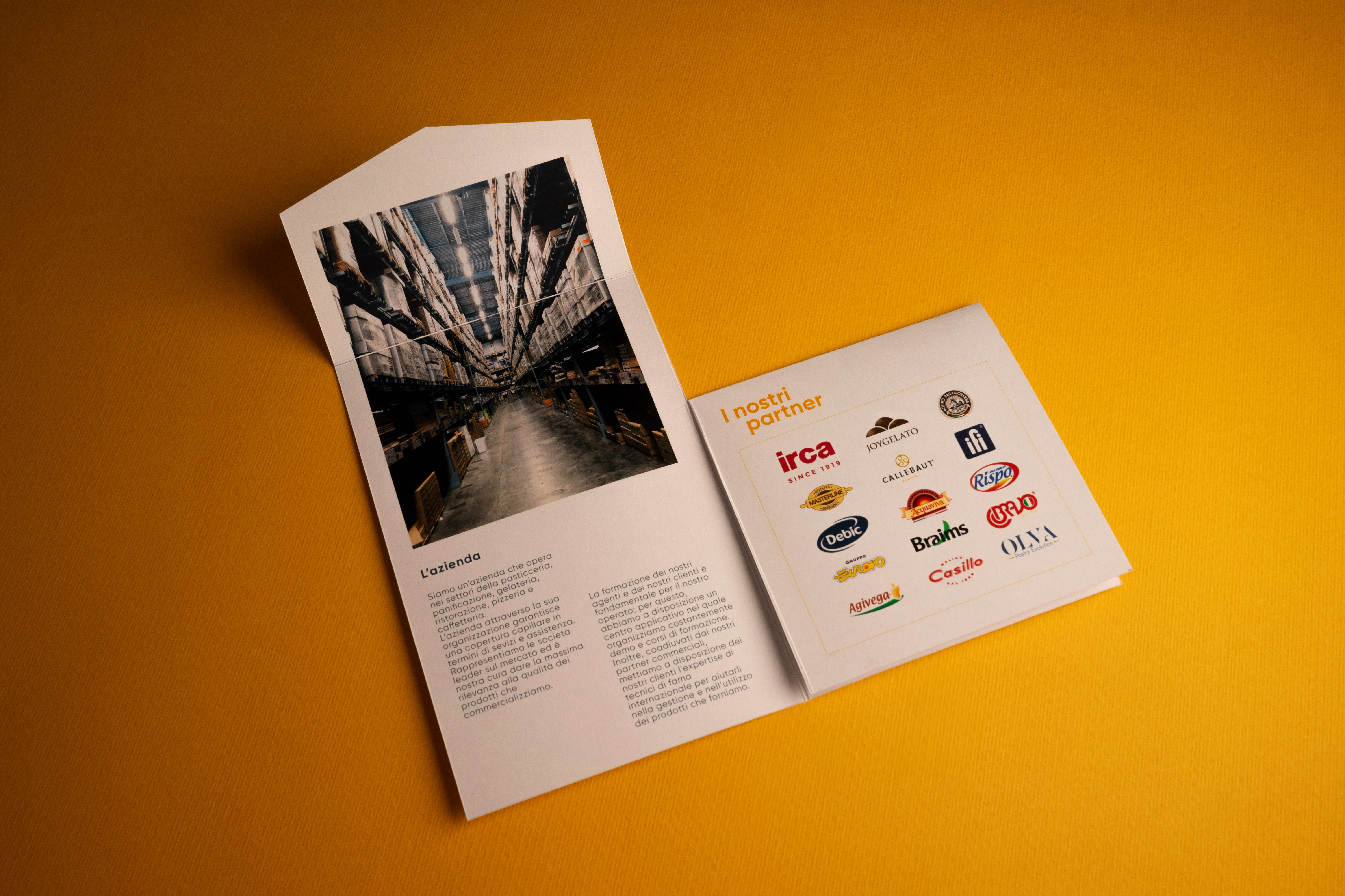
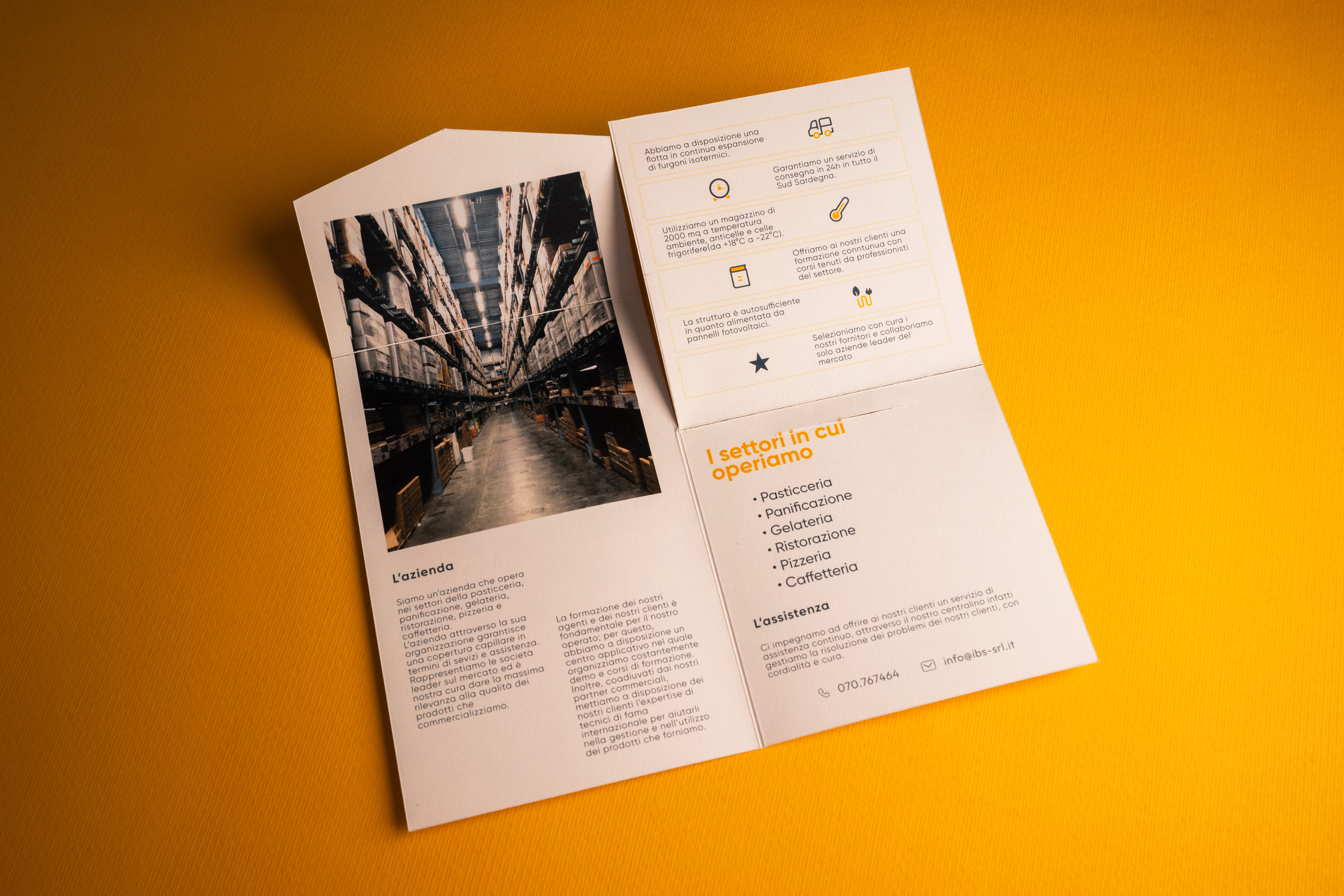
The idea was to send them a letter (hence the format) to tell them "how things are going," just like you would with an old friend. A photo of the facility is revealed first, accompanied by a description. Then the clients are introduced, and through infographics, the way of collaborating with them is explained. Finally, on the back, the company’s contact information is provided.
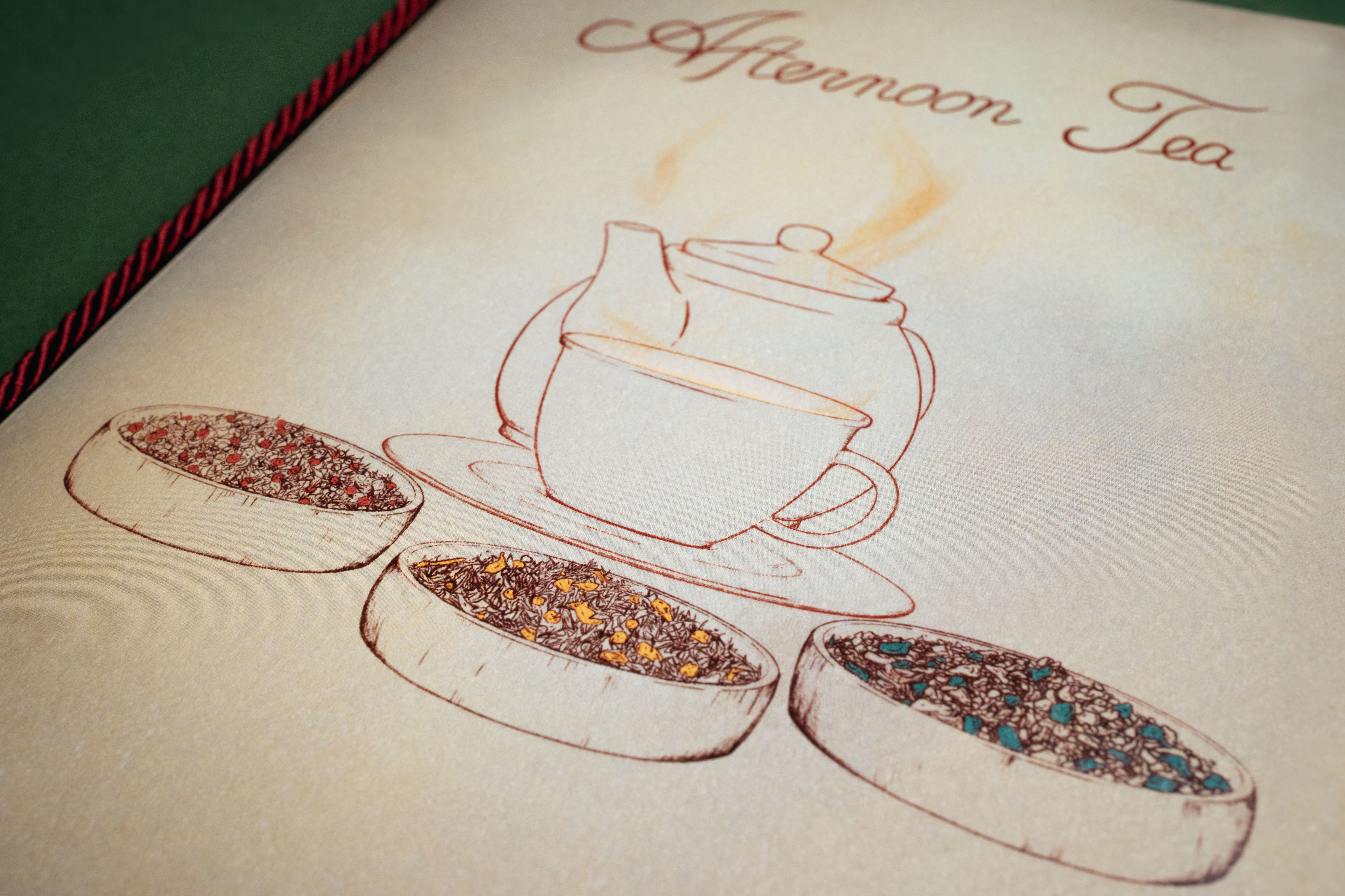
This project was developed in harmony with the venue's tone of voice, aiming to convey the warmth and comfort experienced within the space. The careful selection of materials and finishes was made to ensure that customers feel at ease, as if they were at home.

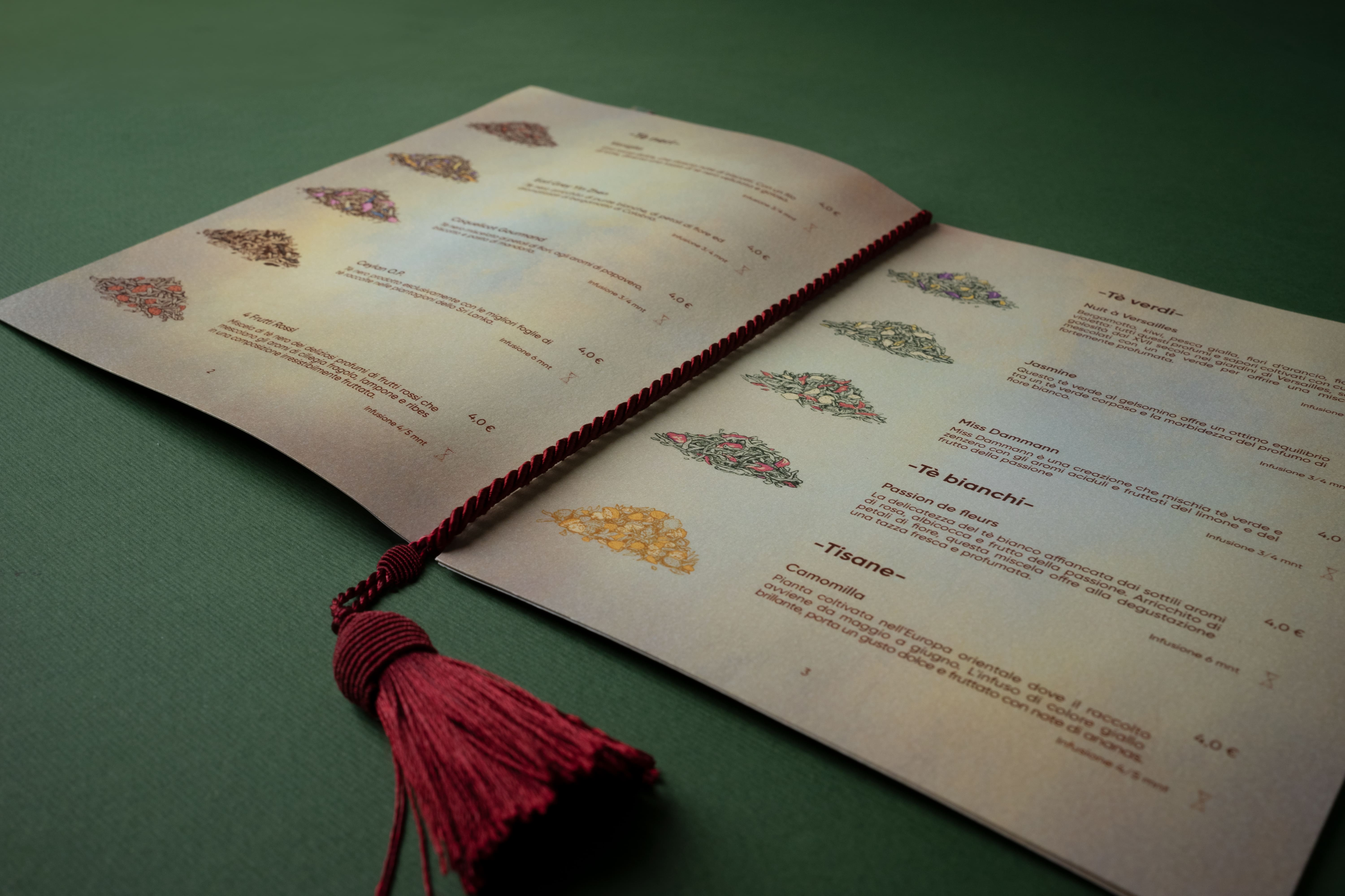
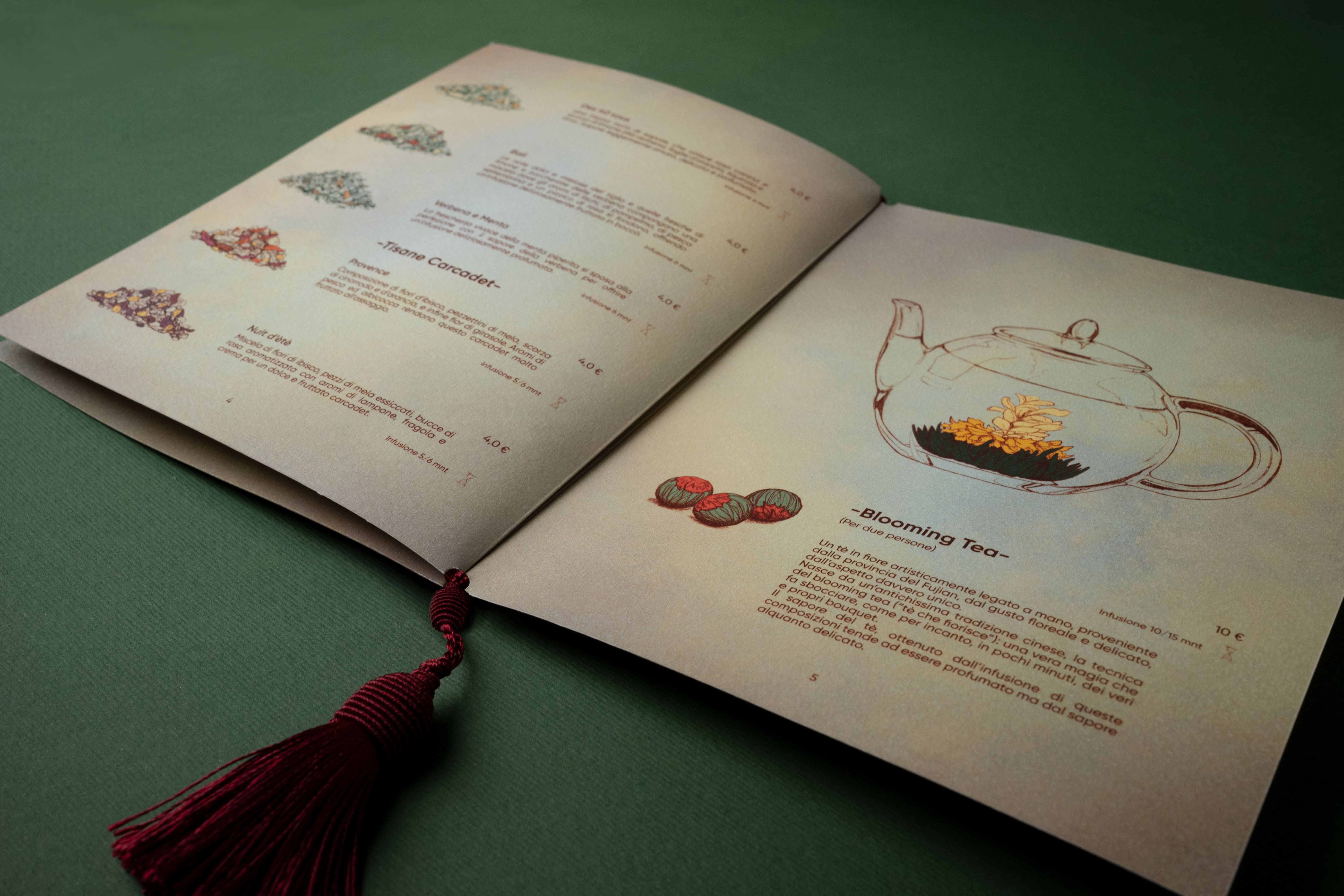
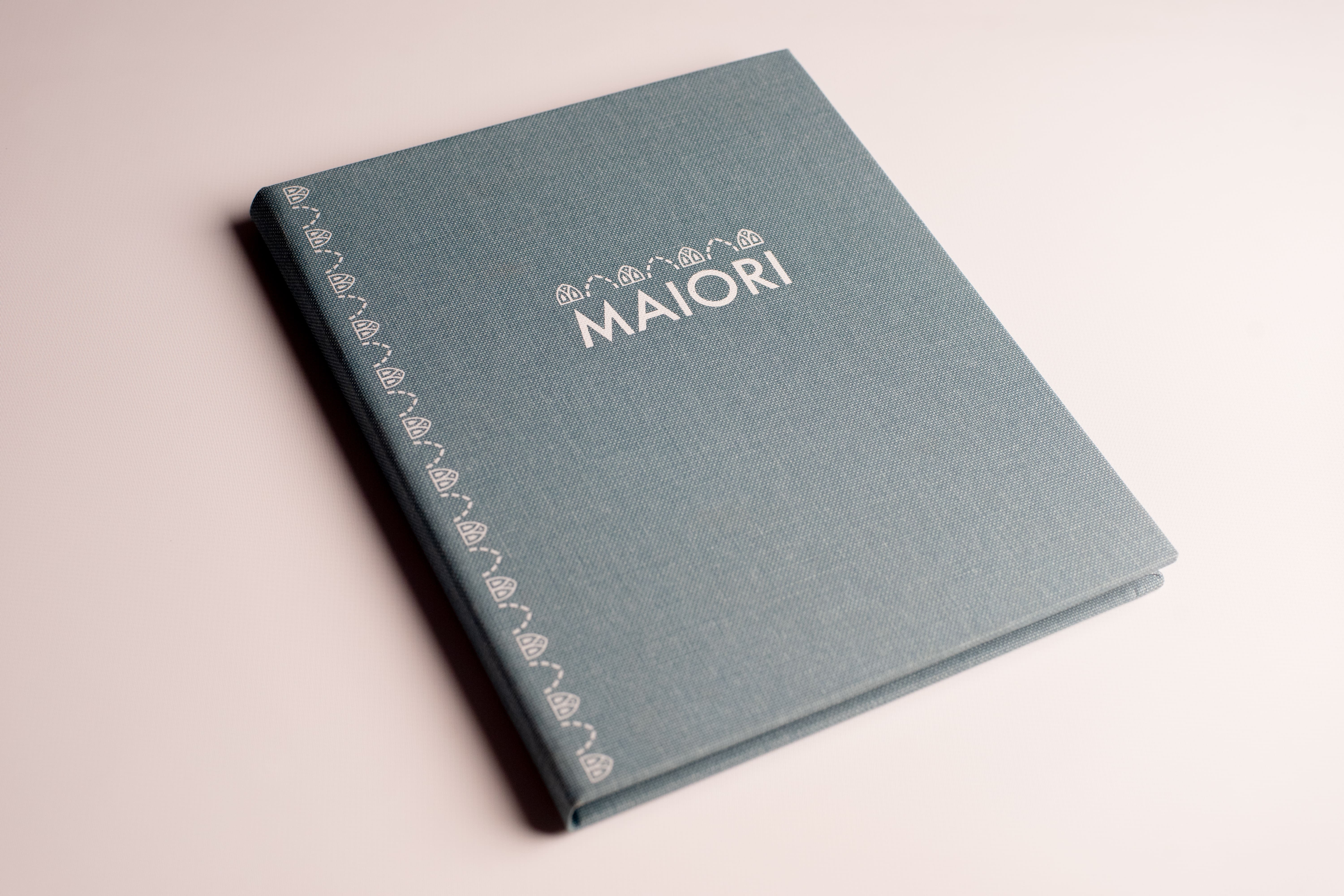
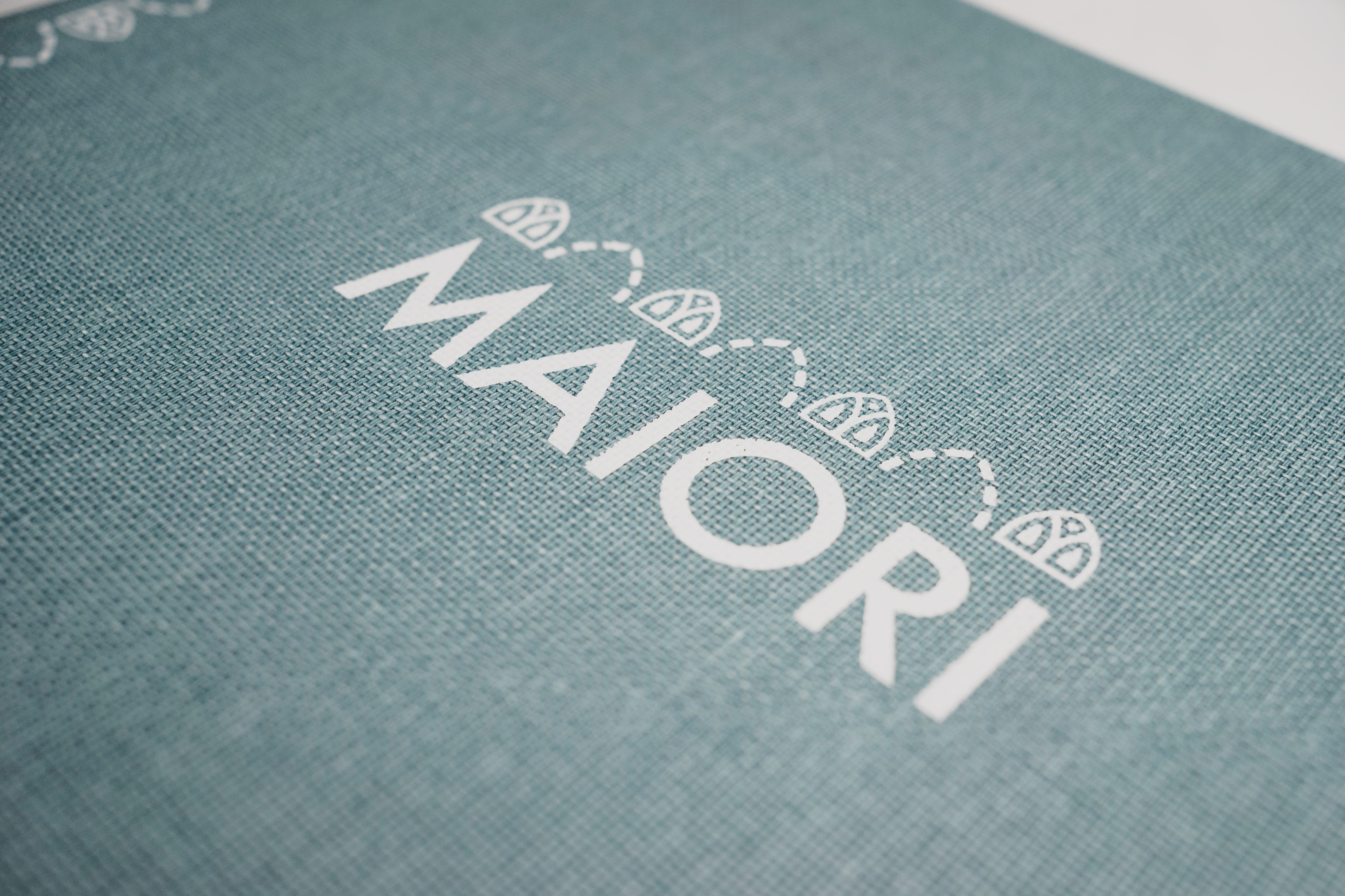
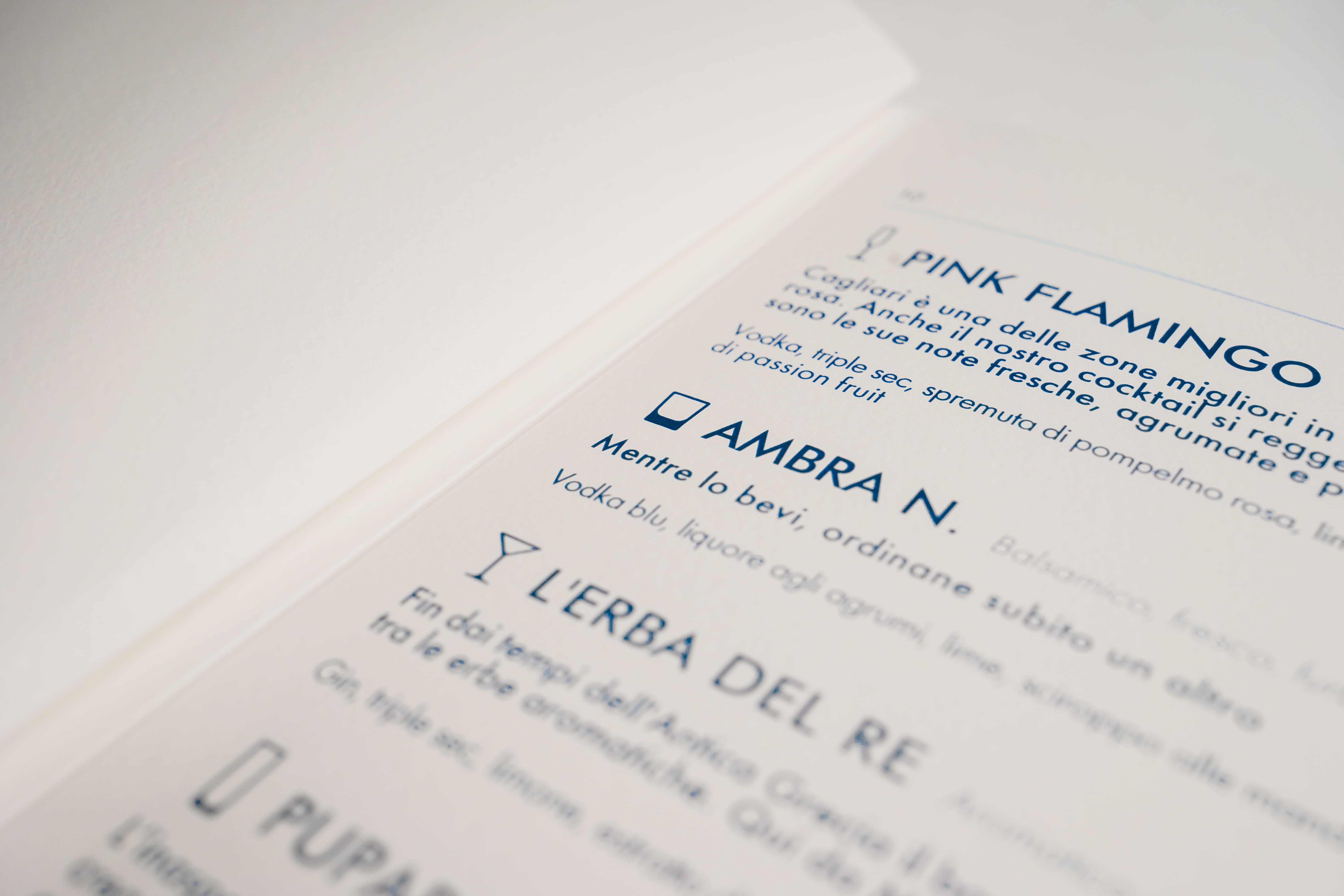
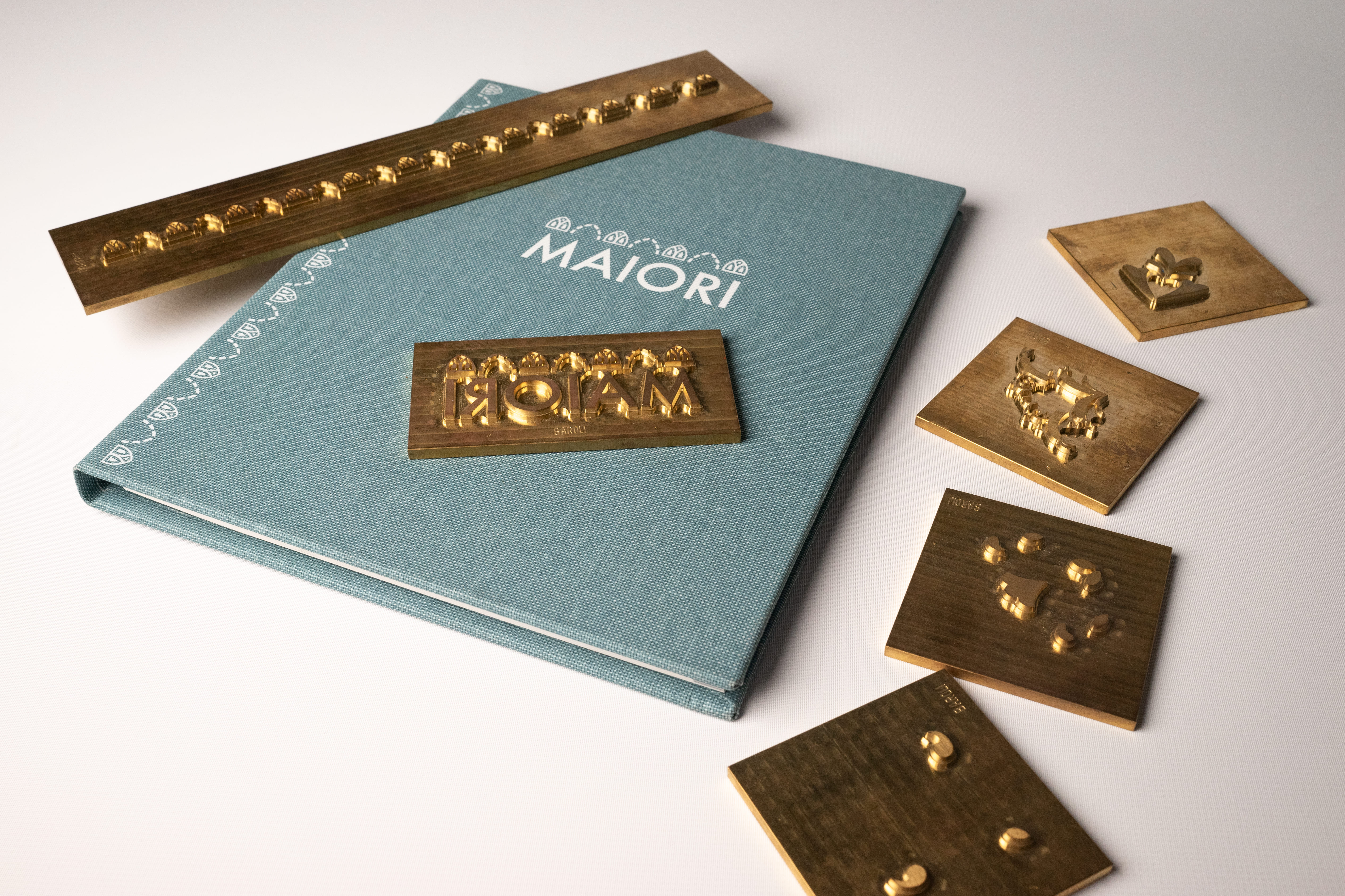
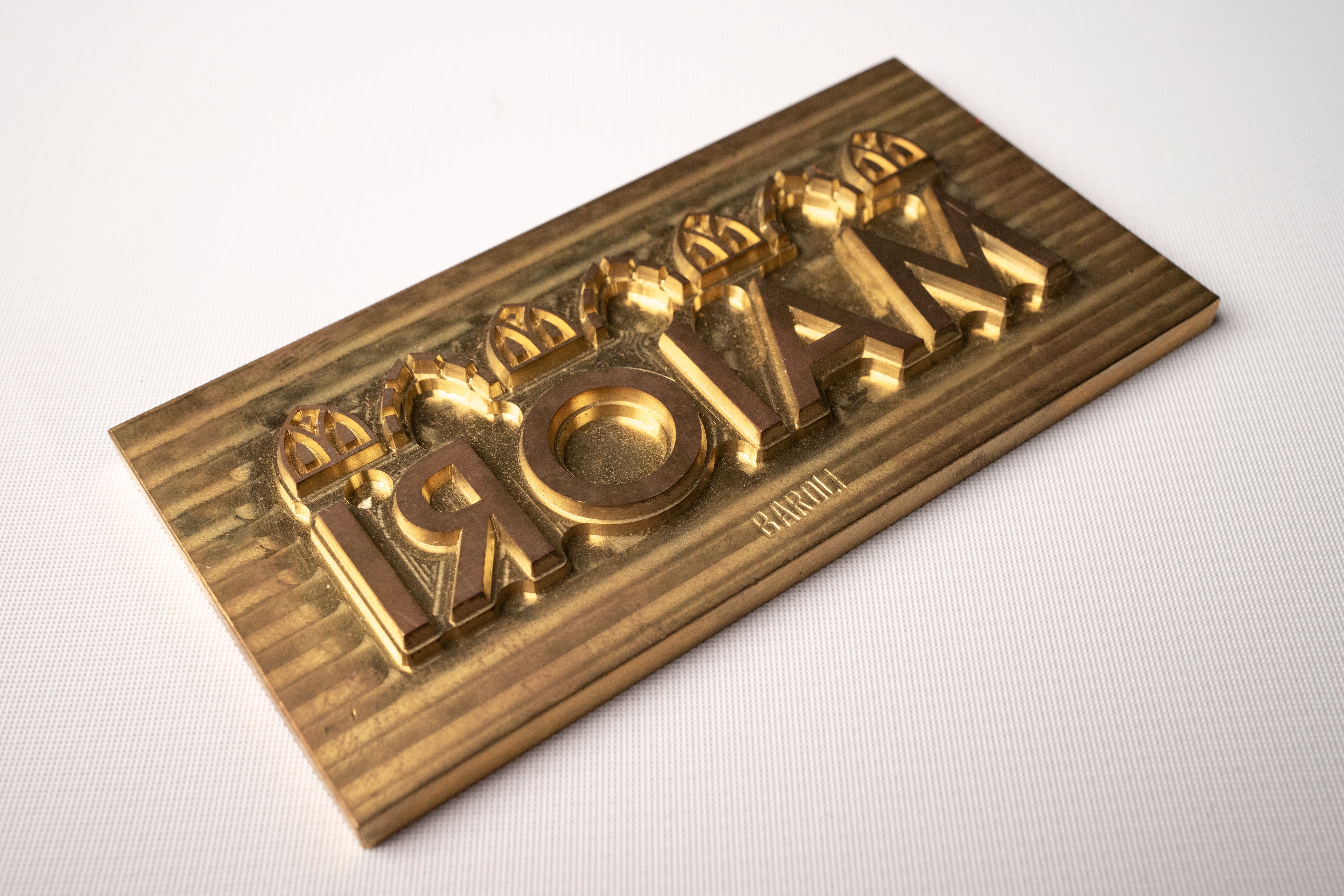
The Maiori menu is a project developed in collaboration with a typography in Milan. We paid attention to every detail, from the selection of materials to the creation of the matrices for hot stamping, leading to a graphic layout that resulted in an intuitive and straightforward agenda style for the customer. The materiality of the materials and the paper harmoniously conveys the care and passion that permeate the venue.
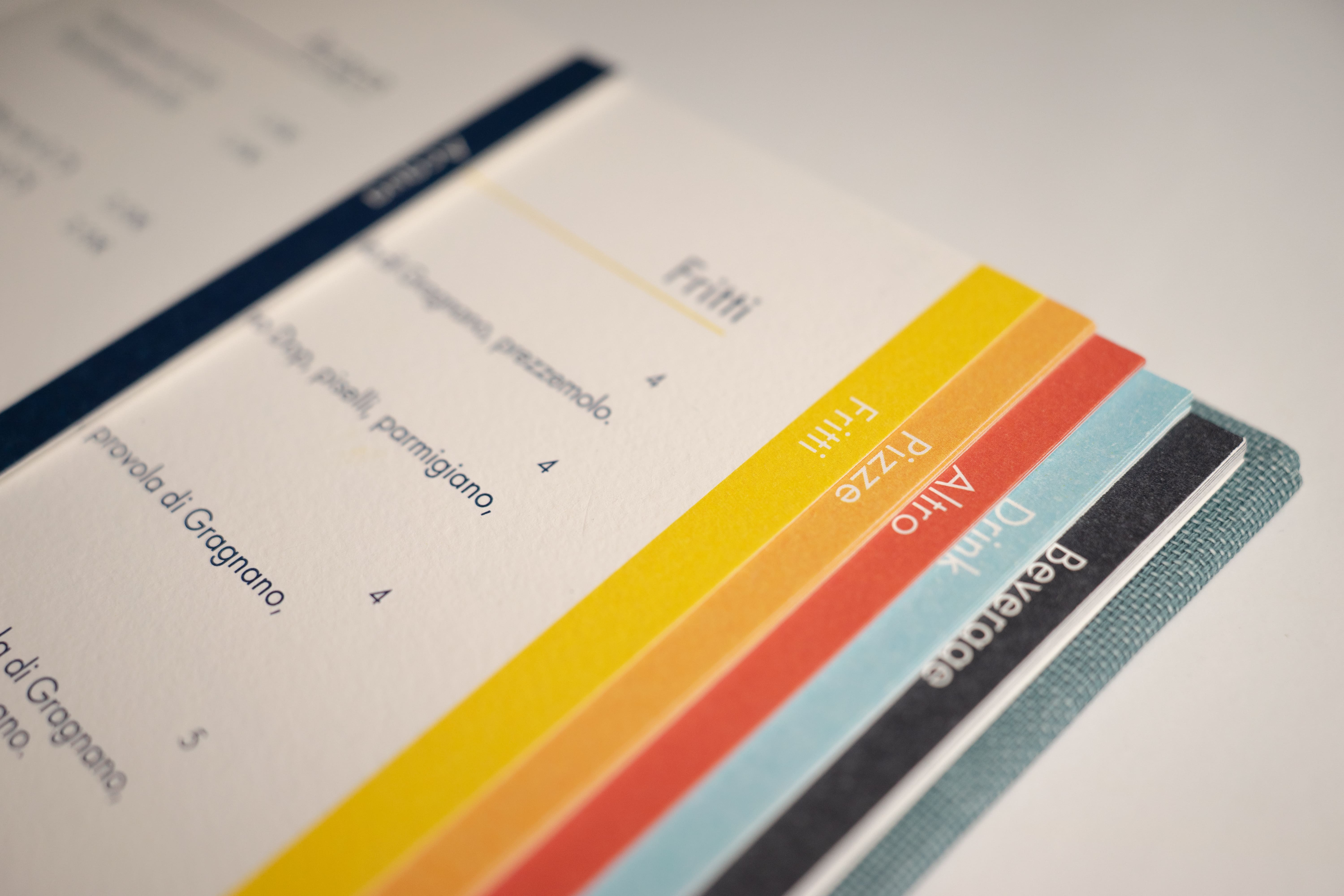
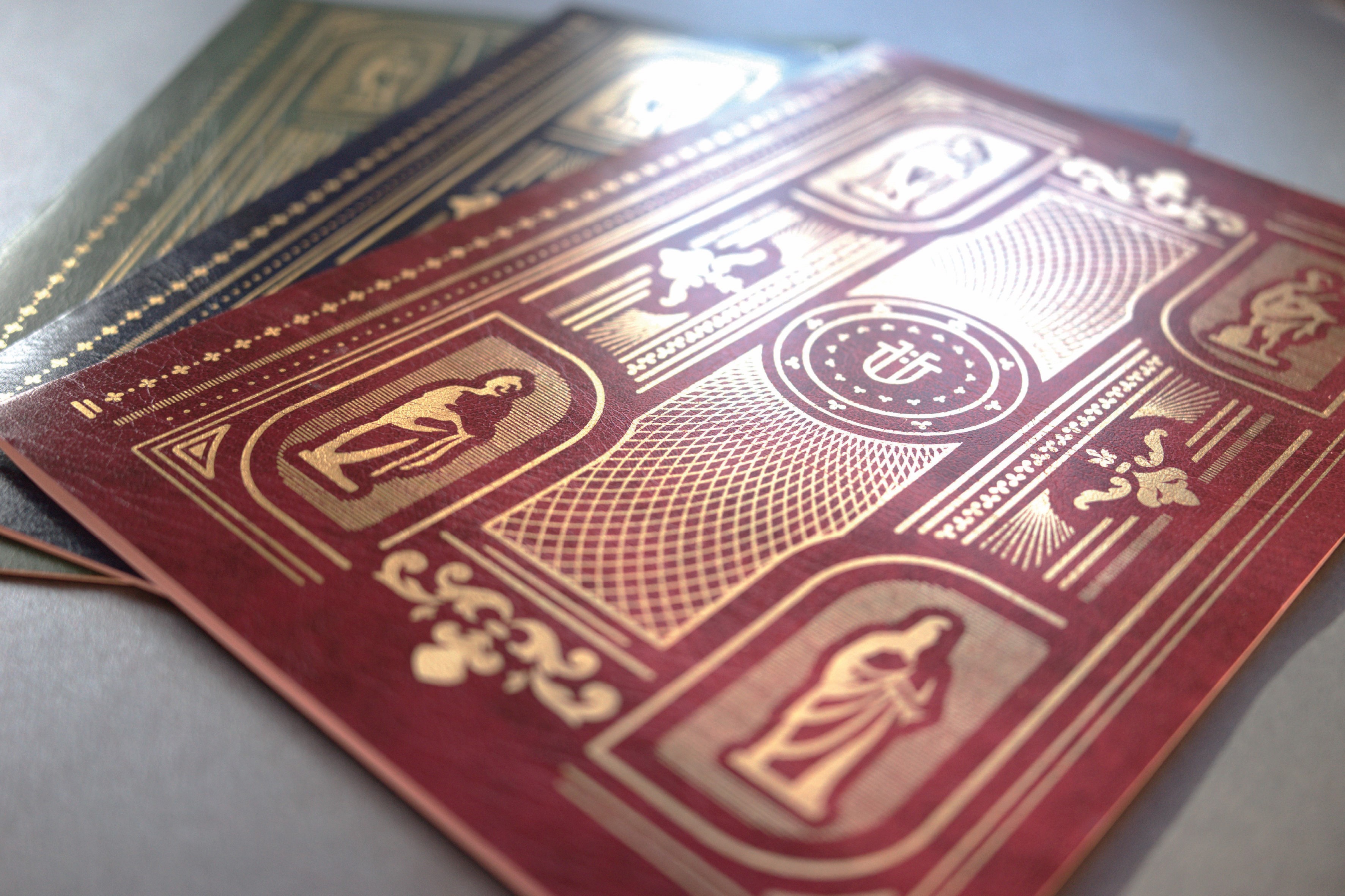
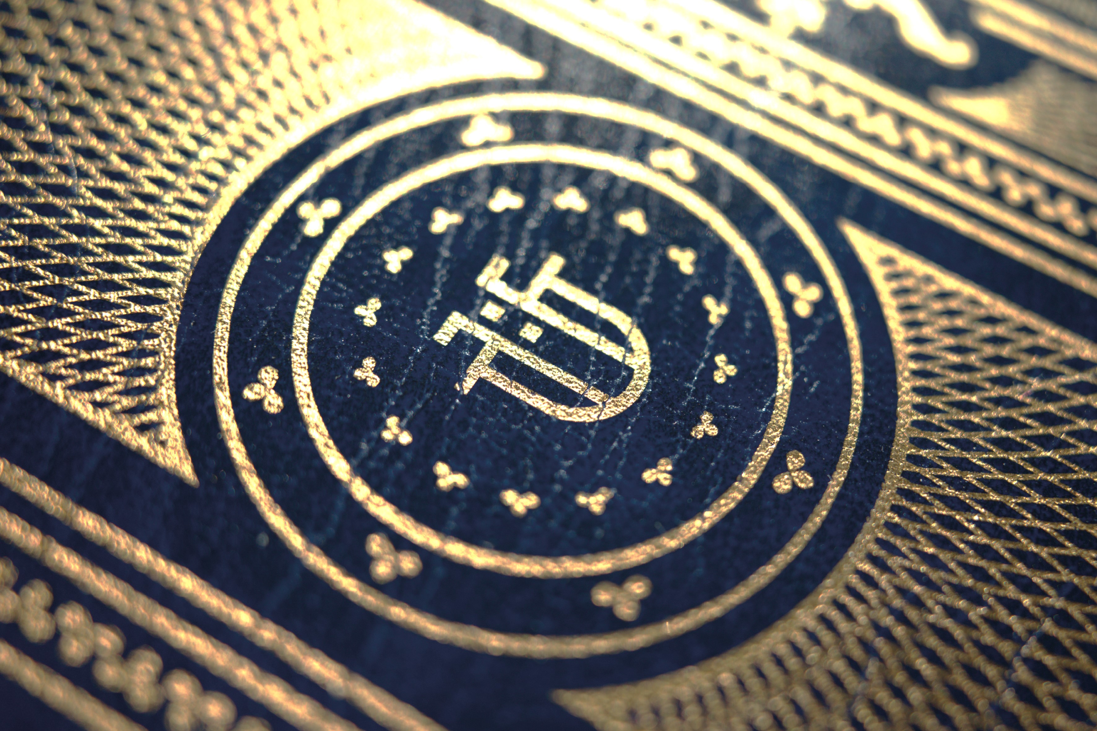
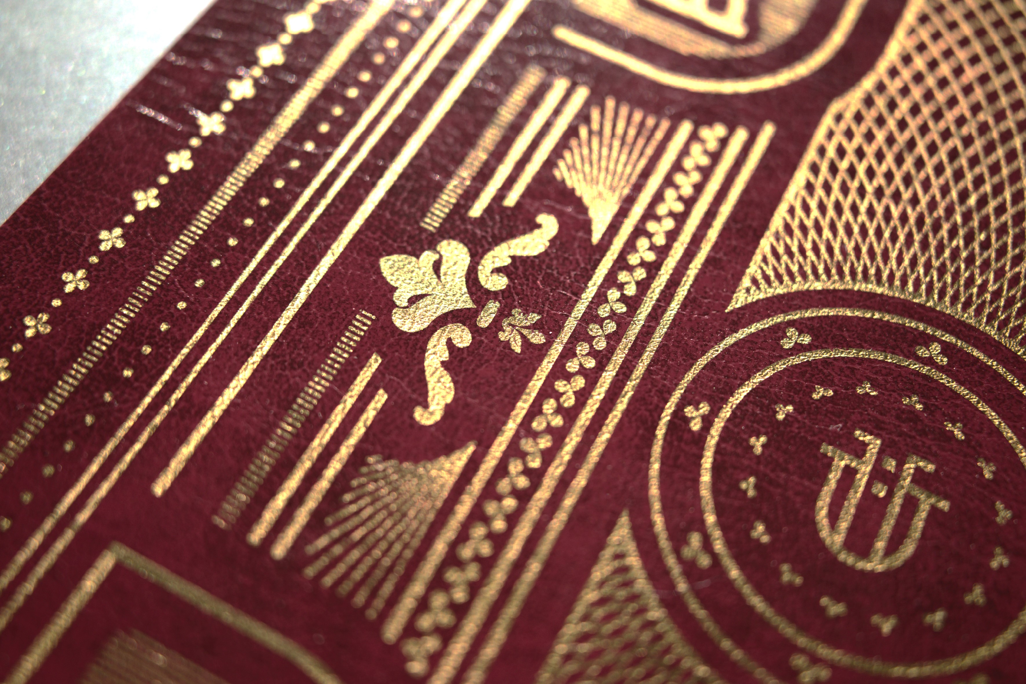
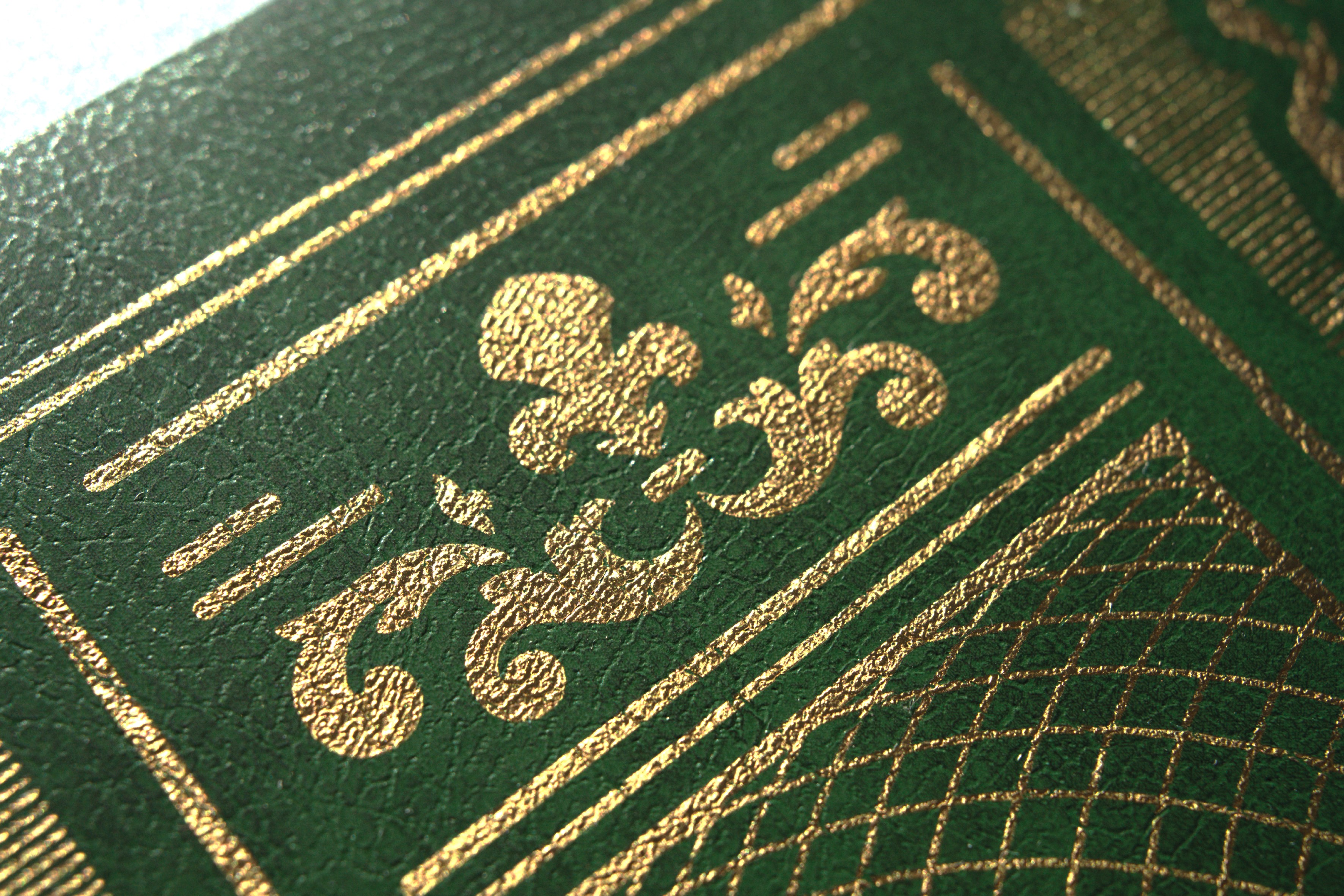
This menu was created using 6 centimeter rolls of gold foil. To generate a uniform pattern, I worked with four laminated strips, varying their distance from the edge to create the illusion of continuity between sections. Several attempts were made to achieve the final result, which is distinguished by a different background color depending on the season.